
Case Study Landing Pages: Architecture and Conversion
Structure case study landing pages so readers can scan customer context, implementation, outcomes, methodology, and quotes without losing the claim boundaries behind the proof.
A case study landing page works when the evidence is easy to inspect, not simply when the page looks polished. The reader should be able to understand the customer situation, what changed, how the result was measured, and where the limits are without hunting through a long narrative. Good architecture makes evidence scannable while keeping context close to the claims it qualifies.
That means the page has two jobs at once. It must tell a coherent customer story, and it must preserve enough methodology and attribution that the story does not become a sales claim detached from its source. A customer quote should remain distinguishable from company-authored interpretation, and a conversion CTA should not imply that the case-study outcome is typical or guaranteed.
| Landing-page block | Reader question | Evidence to keep nearby |
|---|---|---|
| Customer summary | Is this situation relevant to me? | Role, context, approved identity details |
| Challenge | What problem or constraint existed? | Customer source and scope |
| Implementation | What actually changed? | Process, conditions, stakeholders |
| Outcome | What result was observed? | Metric definition, baseline, period, methodology |
| Quote | How did the customer describe the experience? | Original interview and approved wording |
| CTA | What should I do next? | No implication that the customer result is guaranteed |
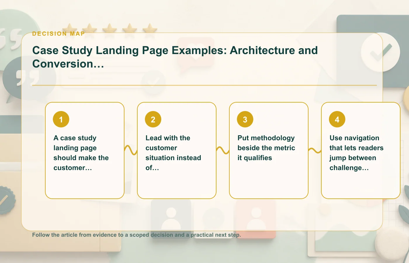
A case study landing page should make the customer evidence scannable
Scanning is not the same as oversimplifying. A useful page lets readers quickly locate the customer, challenge, implementation, result, and evidence while preserving enough detail to interpret each part. The headline can summarize the story, but the source record should remain visible through attribution, methodology notes, supporting context, or links to deeper detail.
Design for evidence discovery
Use section labels that describe the customer story rather than generic marketing slogans. Keep a short context summary near the top, then allow readers to jump to challenge, implementation, outcome, and methodology. If a result depends on a particular period or baseline, put that qualification near the number rather than hiding it in the footer.
- Identify the customer and relevant context at an approved level.
- Separate customer quotes from company-authored analysis.
- Keep result definitions close to the result itself.
- Link to supporting methodology when the page cannot carry all detail inline.
- Make it possible to find implementation conditions without reading every paragraph.
The case studies library is useful when comparing this landing-page architecture with other case-study formats.
Lead with the customer situation instead of a vendor slogan
A reader evaluating a case study wants to know whether the customer's starting point resembles their own. "Transform your business" tells them little. A concise customer situation—role, operating context, challenge, and relevant constraint—gives the result a frame.
Build the opening around relevance
Start with what the customer was trying to accomplish and why the existing approach was insufficient. Avoid exaggerating the problem to make the story more dramatic. If the customer had a narrow workflow issue, describe that narrow issue rather than turning it into an existential business crisis.
Then introduce the intervention in factual terms. What was implemented? Which part of the process changed? Who was involved? The reader should be able to understand the path between the challenge and outcome without assuming that the product itself produced the result automatically.
Customer quotes can add perspective here, but they should not substitute for the factual setup. Keep quotation marks for language the customer actually approved, and keep the source interview available so later editors can verify the final wording.
Put methodology beside the metric it qualifies
A large number can dominate a landing page, which is exactly why its definition needs to be nearby. If the reader has to scroll to a distant methodology page to discover what the metric means, the headline may communicate a stronger result than the evidence supports.
Give every material metric a small evidence frame
| Metric question | What to show or retain |
|---|---|
| What is measured? | Clear metric definition |
| Compared with what? | Baseline or comparison condition |
| Over what period? | Relevant dates or duration |
| Where did the data come from? | Source system or supporting customer record |
| What conditions affected it? | Implementation context or relevant limitations |
If the result cannot be verified to the required level, do not compensate with a vague "up to" headline or a polished chart. Use the narrower qualitative claim the evidence can support. The CTA can still invite the reader to learn more without implying that they should expect the same outcome.
Use navigation that lets readers jump between challenge, implementation, and result
Case studies often serve more than one reader. An executive may want the headline outcome and customer relevance. An operator may care more about implementation. A technical evaluator may look for methodology or constraints. Navigation can support all three without duplicating the story.
Create a short evidence-oriented table of contents
Useful anchors include customer context, challenge, implementation, result, methodology, and customer perspective. The exact labels can vary, but the navigation should reflect the actual story. Do not add a "results" anchor if the page has only a testimonial and no result evidence.
Navigation is also a quality-control tool. If the editorial team cannot name the implementation section or methodology section, the source material may be missing something important. Building the page outline before design helps surface those gaps early.
For more detailed evidence structures in B2B and SaaS stories, see B2B and SaaS case study structures worth adapting.
Supporting quotes should add perspective rather than repeat the headline number
A quote is most useful when it explains the experience behind the result: why the change mattered, what implementation felt like, what surprised the customer, or what they would tell a peer. Repeating the same metric in quotation marks adds little and can make the story feel scripted.
Choose quotes for information density
Look for statements that supply context unavailable elsewhere on the page. A customer might explain the decision process, describe a constraint, or qualify the outcome. Those details can make the case study more credible because they show the result in an actual operating environment.
- Keep the quote close to the section it illuminates.
- Use meaningful attribution where permission allows it.
- Do not merge separate answers into a stronger statement.
- Preserve qualifiers that materially change the meaning.
- Keep the original interview and approval record.
If a quote is shortened for a card, compare it with the source again. A clean edit is fine; a stronger claim the customer never made is not.
The case study template can help turn this architecture into a repeatable production workflow.
Build the conversion path around the reader's next question
A case study landing page should convert by helping the reader continue evaluation, not by using the customer result as a guarantee. The CTA can invite a demo, consultation, product exploration, or another relevant next step, but its wording should remain separate from the proof claim.
Match CTAs to evidence depth
Near the top, a low-friction CTA may let the reader explore the product while the case study establishes relevance. After the implementation section, a CTA can point toward technical or service detail. Near the outcome, the CTA can invite a conversation about the reader's own situation without suggesting they will reproduce the customer's result.
| Reader state | Useful next step | Claim boundary |
|---|---|---|
| Scanning relevance | Explore the solution or related case studies | Do not equate similar industry with guaranteed outcome |
| Evaluating implementation | See implementation detail or discuss requirements | Keep customer-specific conditions visible |
| Evaluating outcome | Review methodology or talk about their own baseline | Do not present the case result as typical without evidence |
This approach makes conversion feel like a continuation of evidence rather than a jump from customer story to unsupported promise.
Maintain the page after publication
Case-study landing pages can go stale. Customers rebrand, products change, permission changes, links break, and metrics lose context. Keep a review trigger with the page so the evidence does not remain live indefinitely without an owner.
Retain a compact publication record
- Final approved customer quotes and brand assets.
- Source interviews and supporting metric records.
- Methodology definitions used on the live page.
- Internal-link destinations and supporting documents.
- Owner and conditions that should trigger a re-review.
If a later editor wants to strengthen a headline, add a new metric, or move a quote into an ad, treat that as a new evidence decision. Do not assume the original approval automatically covers a broader claim or different channel.
Run a claim-by-claim editorial review before design sign-off
The final QA should follow the claims, not the page sections. Create a list of every material outcome statement, customer quote, chart, screenshot, logo, and trust signal on the page. For each one, identify the source record and the permission or approval that allows publication. This catches problems that visual QA often misses.
A page can be perfectly responsive and still contain an unsupported claim because a designer shortened a qualifier, replaced a customer label, or turned a methodology note into a decorative footnote. Treat design changes that affect meaning as editorial changes.
| Asset | Pre-publication question |
|---|---|
| Headline result | Does the claim match the defined metric and customer scope? |
| Customer quote | Can it be traced to the source and final approval? |
| Chart or screenshot | Can the source, period, and relevant definition be reconstructed? |
| Customer logo | Is its use covered by the approved brand-asset permission? |
| CTA wording | Does it avoid implying the case-study result is guaranteed for the reader? |
Once the page is approved, archive the evidence map with the live URL and publication date. That gives future editors a reliable starting point when they update the page instead of forcing them to infer what an earlier team meant or which source originally supported a prominent customer claim in the published landing-page experience overall reliably.
FAQ: case study landing pages
Should the headline lead with the customer result?
It can when the result is properly supported, but the page should quickly supply the customer context and methodology needed to interpret it. A customer-situation headline can be better when relevance matters more than a single number.
How much methodology belongs on the page?
Enough to qualify the material metric. Put essential definitions beside the claim and link to deeper methodology when necessary.
Should quotes repeat the main metric?
Usually they are more valuable when they add customer perspective, implementation context, or tradeoffs instead of restating a number already visible on the page.
How this page was prepared
Reviewed by Social Proofs Standards Editor. Claims, terminology, and time-sensitive details were checked against the sources listed below and the page was last updated September 2, 2026.
AI-assisted tools supported research organization or drafting; editorial review remained responsible for source selection and the published conclusions.
Sources and verification
Primary and authoritative references used to verify this article: